


たけ坊
今回はAngularのフォーマットを使った内容だよ!
見栄えが変わるんですよね?楽しみ‼
前提
ここまでの流れを知りたい人はここからサイトへ!

headerを変更してみる
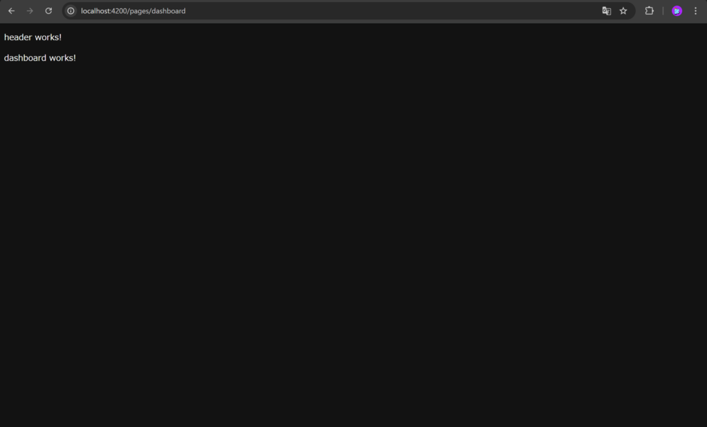
header works!
になっているHeaderをカッコ良いものに変更しようと思います。
headerのディレクトリは以下のようになっています。
        └── app/
            ├── core/
            │   └── header/
            │       ├── header.component.html
            │       ├── header.component.ts
            │       └── header.component.less
ここに、Angularのmaterialを使用して、一気にカッコ良いものにしていきます。
Angularにはたくさんのデザインのフォーマットがあり、それを活用することができます。
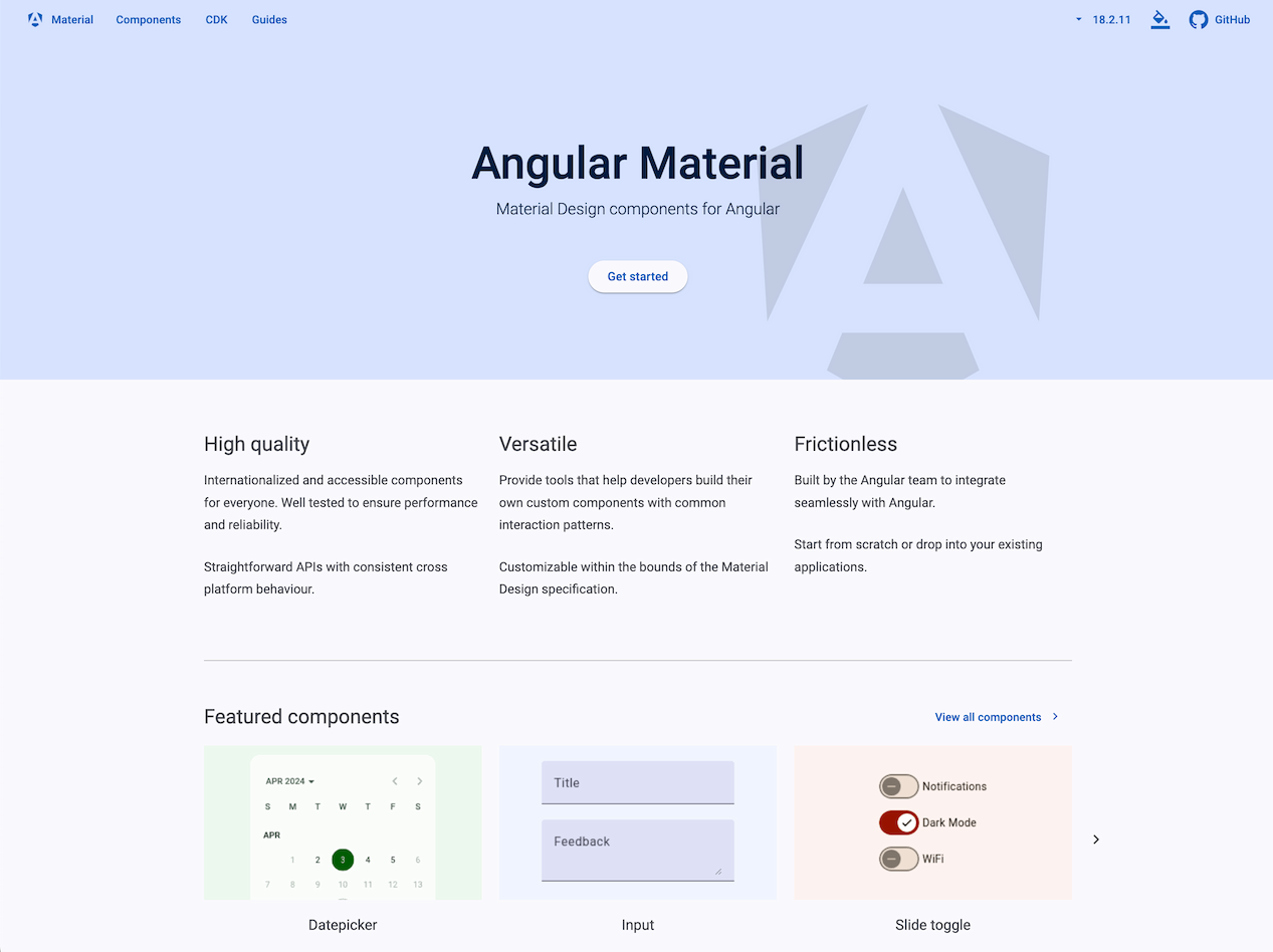
Angular Material
UI component infrastructure and Material Design components for Angular web applications.
material.angular.dev
Angular materialの中のTool barを活用してコードを書きます。どのコードを使っているのか、サイトの中を探してみてください!
header.component.html
<mat-toolbar>
    <button mat-icon-button class="example-icon" aria-label="Example icon-button with menu icon">
      <mat-icon>menu</mat-icon>
    </button>
    <span>Pain Log</span>
    <span class="example-spacer"></span>
  </mat-toolbar>
header.component.ts
import { Component } from '@angular/core';
import {MatIconModule} from '@angular/material/icon';
import {MatButtonModule} from '@angular/material/button';
import {MatToolbarModule} from '@angular/material/toolbar';

@Component({
  selector: 'app-header',
  standalone: true,
  imports: [MatToolbarModule, MatButtonModule, MatIconModule],
  templateUrl: './header.component.html',
  styleUrl: './header.component.less'
})
export class HeaderComponent {

}
dashboardを変更してみる
dashboardのディレクトリは以下のようになっています。
        └── app/
            ├── features/
            │   └── pages/
            │       ├── pages.component.html
            │       ├── pages.component.ts
            │       ├── pages.component.less
            │       └── dashboard/
            │           ├── dashboard.component.html
            │           ├── dashboard.component.ts
            │           └── dashboard.component.less
ここもAngular materialを使用します。
Angular Material
UI component infrastructure and Material Design components for Angular web applications.
material.angular.dev
上記を参考にコードを書いていきます。
dashboard.component.html
<table mat-table [dataSource]="dataSource" class="mat-elevation-z8">

    <!-- Position Column -->
    <ng-container matColumnDef="position">
      <th mat-header-cell *matHeaderCellDef> No. </th>
      <td mat-cell *matCellDef="let element"> {{element.position}} </td>
    </ng-container>

    <!-- Name Column -->
    <ng-container matColumnDef="name">
      <th mat-header-cell *matHeaderCellDef> Name </th>
      <td mat-cell *matCellDef="let element"> {{element.name}} </td>
    </ng-container>

    <!-- Weight Column -->
    <ng-container matColumnDef="weight">
      <th mat-header-cell *matHeaderCellDef> Weight </th>
      <td mat-cell *matCellDef="let element"> {{element.weight}} </td>
    </ng-container>

    <!-- Symbol Column -->
    <ng-container matColumnDef="symbol">
      <th mat-header-cell *matHeaderCellDef> Symbol </th>
      <td mat-cell *matCellDef="let element"> {{element.symbol}} </td>
    </ng-container>

    <tr mat-header-row *matHeaderRowDef="displayedColumns"></tr>
    <tr mat-row *matRowDef="let row; columns: displayedColumns;"></tr>
  </table>
dashboard.component.ts
import { CommonModule } from '@angular/common';
import { Component } from '@angular/core';
import {MatTableModule} from '@angular/material/table';

export interface PeriodicElement {
  name: string;
  position: number;
  weight: number;
  symbol: string;
}

const ELEMENT_DATA: PeriodicElement[] = [
  {position: 1, name: 'Hydrogen', weight: 1.0079, symbol: 'H'},
  {position: 2, name: 'Helium', weight: 4.0026, symbol: 'He'},
  {position: 3, name: 'Lithium', weight: 6.941, symbol: 'Li'},
  {position: 4, name: 'Beryllium', weight: 9.0122, symbol: 'Be'},
  {position: 5, name: 'Boron', weight: 10.811, symbol: 'B'},
  {position: 6, name: 'Carbon', weight: 12.0107, symbol: 'C'},
  {position: 7, name: 'Nitrogen', weight: 14.0067, symbol: 'N'},
  {position: 8, name: 'Oxygen', weight: 15.9994, symbol: 'O'},
  {position: 9, name: 'Fluorine', weight: 18.9984, symbol: 'F'},
  {position: 10, name: 'Neon', weight: 20.1797, symbol: 'Ne'},
];

@Component({
  selector: 'app-dashboard',
  standalone: true,
  imports: [CommonModule, MatTableModule],
  templateUrl: './dashboard.component.html',
  styleUrl: './dashboard.component.less'
})
export class DashboardComponent {
  displayedColumns: string[] = ['position', 'name', 'weight', 'symbol'];
  dataSource = ELEMENT_DATA;
}
変更した結果
headerとdashboardを変更した結果どうなったか見てみましょう。
ng serveまたは
npx ng serve --host 0.0.0.0 --poll 1を実行し、http://localhost:4200/で表示を見ると...
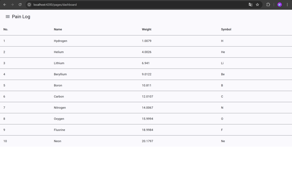
headerとテーブルが表示されました!
次のステップ
次はAPI連携です!