
Angularをはじめとするフロントエンドの実装では、階層と高さ、それに応じたコンポーネントの固定を考えないといけません。
今回は下記のようなリポジトリを考えます。
ng-pain-log/
└── pain-log/
└── src/
└── app/
├── core/
│ └── header/
│ ├── header.component.html
│ ├── header.component.ts
│ └── header.component.less
├── domain/
├── features/
│ └── components/
│ └── search/
│ ├── search.component.ts
│ ├── search.component.html
│ └── search.component.less
│ └── data-table/
│ ├── data-table.component.html
│ ├── data-table.component.ts
│ └── data-table.component.less
│ └── add-button/
│ ├── add-button.component.html
│ ├── add-button.component.ts
│ └──add-button.component.less
│ └── pages/
│ └── dashboard/
│ ├── dashboard.component.html
│ ├── dashboard.component.ts
│ └── dashboard.component.less
├── infrastructures/
├── shared/
├── app.component.html
├── app.component.ts
├── app.component.less
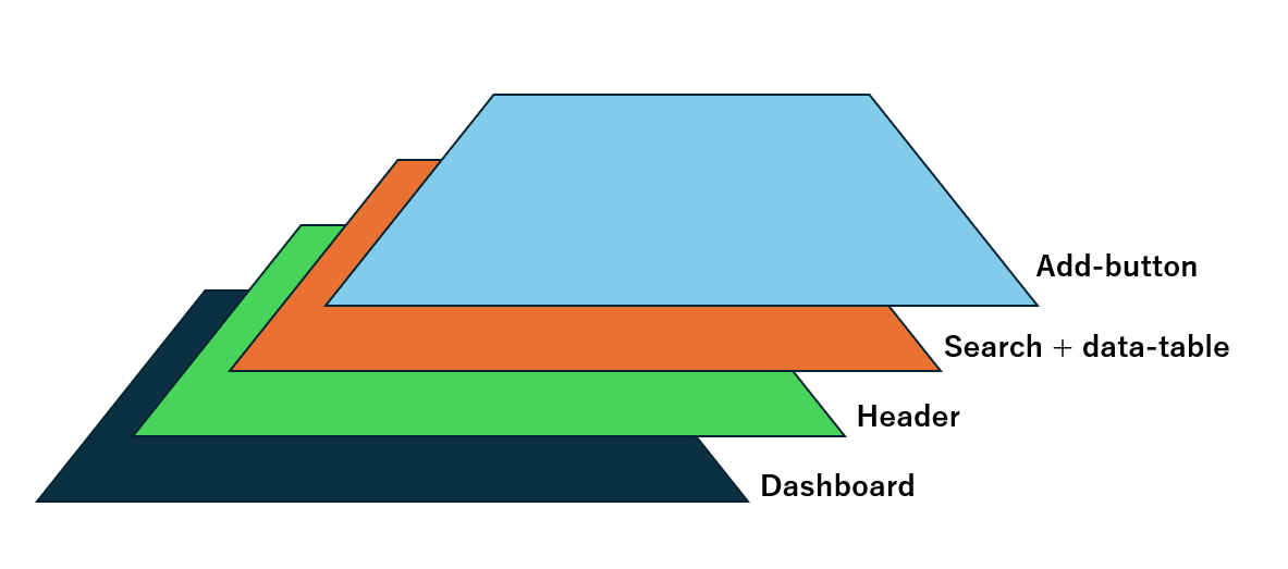
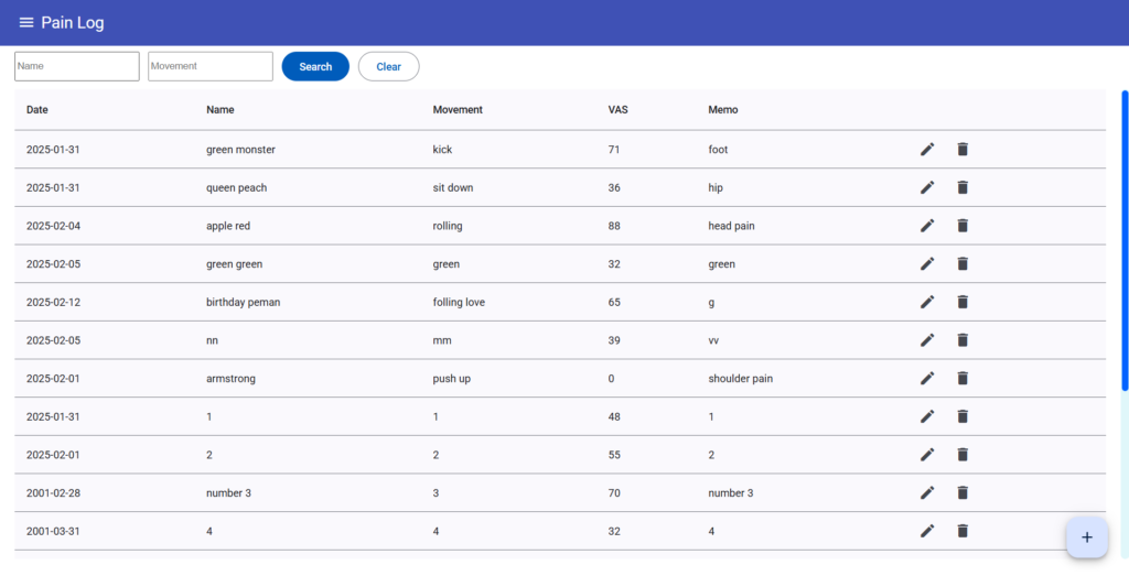
└── app.routes.ts文字だと難しいので図で見ていきましょう。下記のような画面を作成しました。
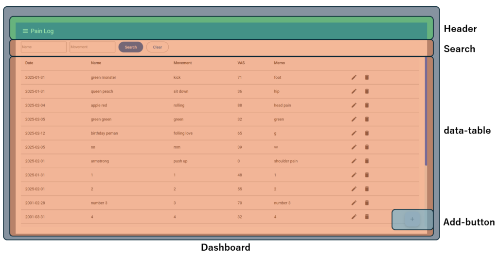
一見するとわかりにくいですが、下記のようなコンポーネントに分かれています。
立体的に見せると下記のような図になります。深いところから浅いところにコンポーネントを重ねていくイメージです。

その深さとともに画面の高さも意識しないといけません。
高さの基準は、100hV が画面いっぱいの高さです。

そこから高さを分割していきます。
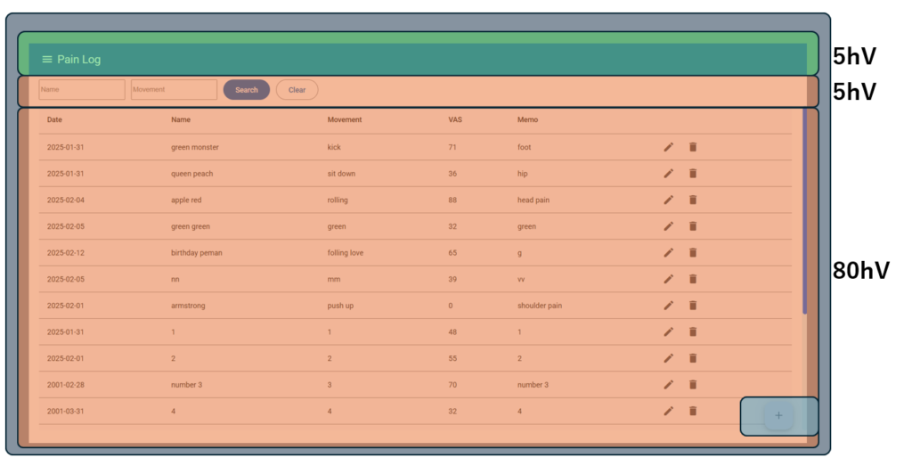
Dashboardは最深部にあり、スクロールできないように固定されています。HeaderとSearchの5+5の10hVはその位置で固定します。
残りの80hVはdata-tableです。data-tableもその位置で固定されていますが、テーブルの中身だけスクロールできるように設定しました。
詳しいコードはこちらです。
header
  :host ::ng-deep {
    height: calc(5vh);
    flex: 0 0 auto;
  }

  .fixed-toolbar {
    position: fixed;
    top: 0;
    width: 100%;
  }
search
.search-container ::ng-deep {
    top: 0;
    margin-top: 64px;
    padding: 8px 0;
    position: fixed;
    width: 100%;
    background: white;
    z-index: 10;
  }

:host ::ng-deep {
    height: calc(5vh);
    flex: 0 0 auto;
}
dashboard(data-table含む)
:host {
  height: 100vh;  /* ビューポート全体を占める */
  display: flex;
  flex-direction: column;
  overflow: hidden;  /* スクロール禁止 */
}

.table-container {
  height: calc(100vh - 10vh);
  margin-top: 84px;
  padding-left: 20px;
  padding-right: 20px;
  max-height: 640px; /* 最大高さ */
  overflow-y: auto;
}
add-button
.add-button ::ng-deep {
    position: fixed;
    right: 30px;
    bottom: 30px;
    z-index: 1000;
    /* 他の要素より前面に表示 */
  }
フロントはこの重ね方や固定の仕方が難しんですよね…。
ぜひ参考にしてみてください!